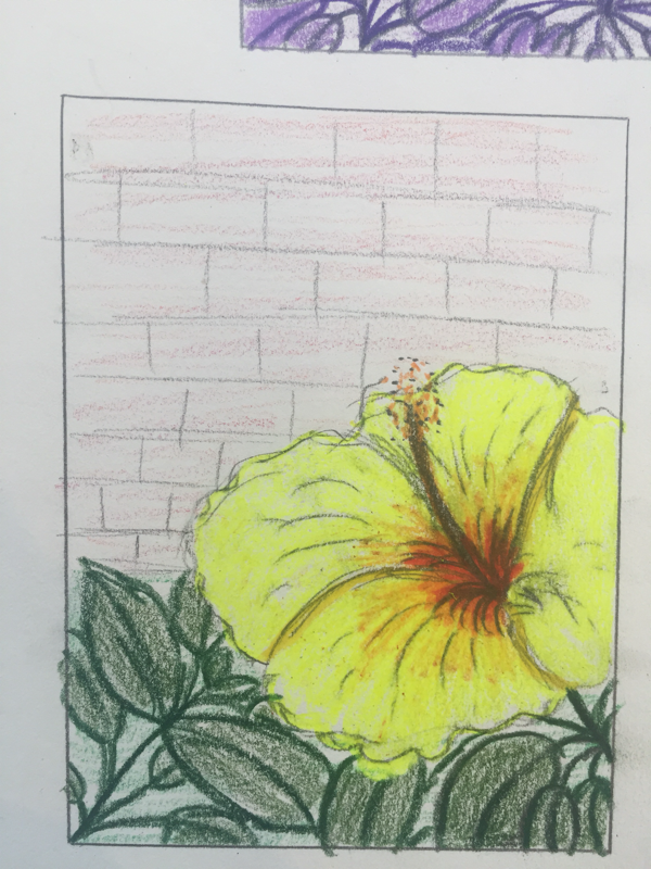
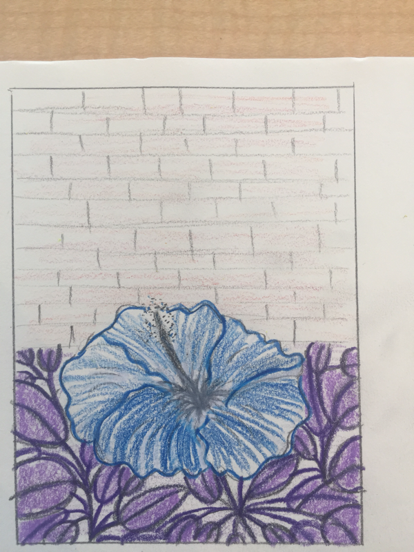
Prisma color practice
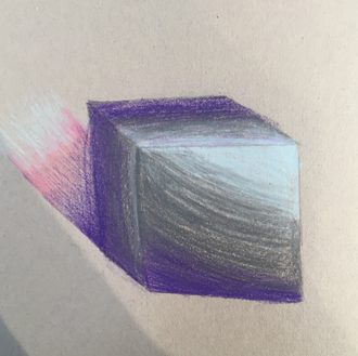
Shape shading with prisma:
Here I was just experimenting with prisma colors because i haven't used them a lot. We were supposed to add shadows and highlights but i was having trouble finding the direction the light was coming from which made my cube look weird.
Here I was just experimenting with prisma colors because i haven't used them a lot. We were supposed to add shadows and highlights but i was having trouble finding the direction the light was coming from which made my cube look weird.
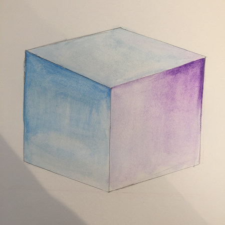
Water color pencil:
I used water color pencils to add shadows to this box and i think it came out way better then the other one and i thought it was cool to turn pencil into paint.
I used water color pencils to add shadows to this box and i think it came out way better then the other one and i thought it was cool to turn pencil into paint.
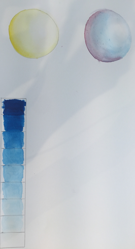
Value chart:
I used water color paint to make a value chart and I think it came out nice because the color blended out. I liked being able to experiment with the amount of water need to make an even transition.
I used water color paint to make a value chart and I think it came out nice because the color blended out. I liked being able to experiment with the amount of water need to make an even transition.
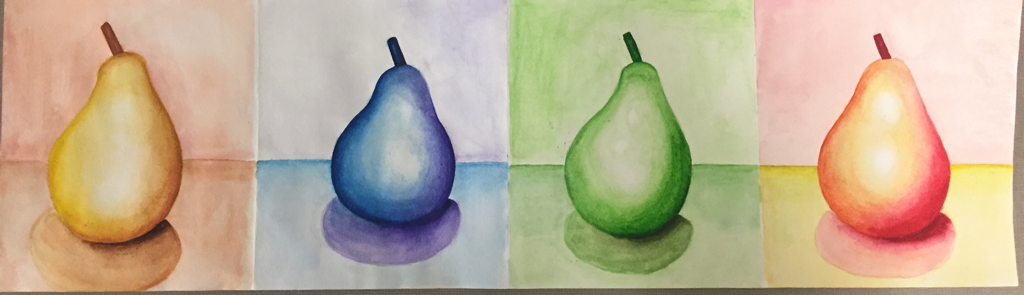
Watercolor Pears:
Going from left to right I painted a warm toned pear, a cool toned pear, a monochromatic pear and a analogous pear. I spent a lot of time blending and just expierementing with how colors blend with each other.
I liked working with watercolor while painting the pears because I was able to show good shadow and highlight
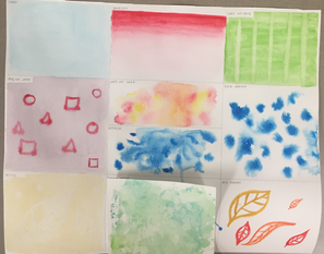
Techniques:
I used water color to create different designed and play around with the different ways it can be used.
I used water color to create different designed and play around with the different ways it can be used.
Watercolor Painting
1. What watercolor techniques proved to be effective in your painting? How and Why?
I layered the watercolor paint and started off with a light wash and then built up the color to get a more opaque color. I didn't want the painting to be too see through so I would add less water to the watercolor in order to get a darker shade. I also added shadows and highlights towards the end because I wanted to see the painting without shadows first to see what parts would need it.
2. How important was using transparent layers in your painting?
It was very important to start off with a light transparent layer and then build up on it because yellow could get really dark quick if I didn't start off light first. Also, after something is dark its hard to go back and lighten it up, so starting off light is the better option and helped me layer with shadows. Also, I used different shades of yellow, some lighter then others, and I wanted the different shades to show so I had to start off light in order to be able to keep the different yellows noticeable.
3. Explain how your composition was successful? Did you utilize all the elements of art and principles of design? Explain.
I originally had a brick background but then I decided to get rid of that and focus more on the flower because I knew most of the detail would be in the flower. I like the composition and wanted the main focus to be on the flower. I thing the stem is a nice contrast with the flower and I think the blue sky makes the flower pop.
4. Was color choice an important factor in the overall success of the painting? Why?
Yes, color choice was an important factor in my painting, I wanted the flower to stand out and I think the yellows allowed me to do that. Also the blue background makes the yellow brighter and the dark stem contrasts with the flower which also makes the flower stand out.
5. Describe your craftsmanship.
I think I added a good amount of detail in the top of the flower and the shadows make the flower come to life and give it dimension which I like. The stem and leaves are also well done in my opinion, I think the have just enough detail to keep the focus on the flower.
6. If you were able to do something different what would it be and why?
If I could add something different I would add more leaves because I don't like the harsh cutoff of the leaves into the sky, so I would try and make the leaves and sky blend more to make the stem look more realistic.
7. Explain to me what you have learned about watercolor and how it has improved or discouraged your development in art.
I have learned a lot about watercolor, and I think it has improved me development in art. I learned that layering is very important and that there are a lot of different techniques someone could use in order to manipulate the watercolor and make cool designs, which I find interesting. It has improved my art because I now know how to better use watercolor and how to get different shades and use techniques that could make my work stand out from someone else's.
Hundertwasser Painting
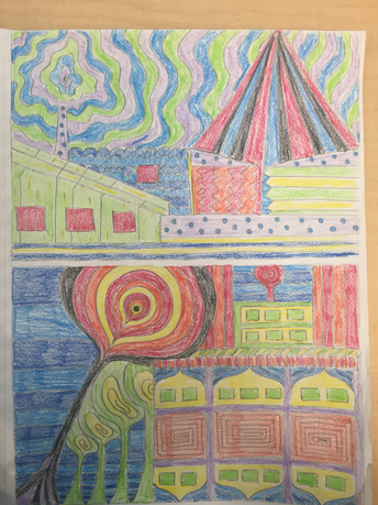
1. Describe the craftsmanship of your painting.
I did many layers of acrylic paint in order to get an opaque color instead of a see through color. I also used many colors that would usually not go together, but placed them in a way that was interesting and made the piece come together. I used many different shapes in order to keep the painting interesting.
2. How does your work embody the artist's style?
I used bold colors and used different patters throughout the painting. I also added a border which tied the whole piece together.
3. Describe your choice of colors/color harmonies and how you used them throughout the artwork.
I wanted bold colors to be used in the painting because I wanted everything to pop. I used random colors and just chose the colors I thought would look good together. I wanted the sky to be warm toned while the trees would be cool tones, everything else was random color choice.
4. What is the emphasis of your artwork?
The trees are the emphasis because they contrast with the sky and really pop out and are what your eyes are drawn to first.
5. How did you use textures and patterns to embellish your artwork?
I did not use texture but I added pattern with a silver sharpie, I also outlined some of the building windows with a silver sharpie in order to add something different to the piece. Once I painted everything I went in with the silver sharpie and added dots where I wanted and also added some strips.
6. How did you put a border on your artwork? How does it enhance the work?
I painted a checker type border because I did not want the border to be the main focus but I also did not want it to be a solid color. So I chose two colors, blue and purple to use in the border. I think it enhances my painting because it utilizes the purple in the tree and ties the whole painting together.
7. Describe any difficulties you had creating this artwork.
I had difficulty choosing which types of patterns to use. I was not sure what would look good with the feel of my piece, but i decided to go simple with the dots because I did not want to focus on too many patterns because of the sky and trees. I though it would be much if I added more pattern within the pattern I already had.
Oil Painting
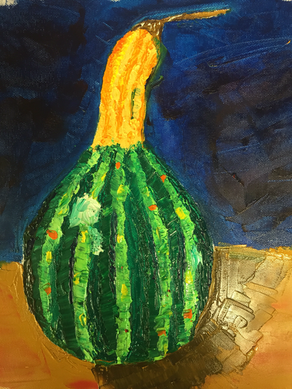
Oil practice:
I used a palette knife to create this piece and it was very difficult because of the size of the palette knife and the size of the squash. I had a hard time adding detail and blending because it was my first time using oil.
I used a palette knife to create this piece and it was very difficult because of the size of the palette knife and the size of the squash. I had a hard time adding detail and blending because it was my first time using oil.
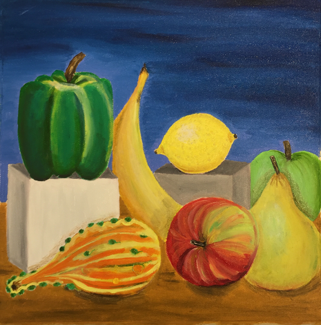
Oil still life:
I liked using a brush better then a palette knife because a brush is easier to control. I found it easier to add detail and shadows. I like this painting because of the texture I added in the oil and I like the colors and hot everything is laid out.
I liked using a brush better then a palette knife because a brush is easier to control. I found it easier to add detail and shadows. I like this painting because of the texture I added in the oil and I like the colors and hot everything is laid out.
Textured landscape painting
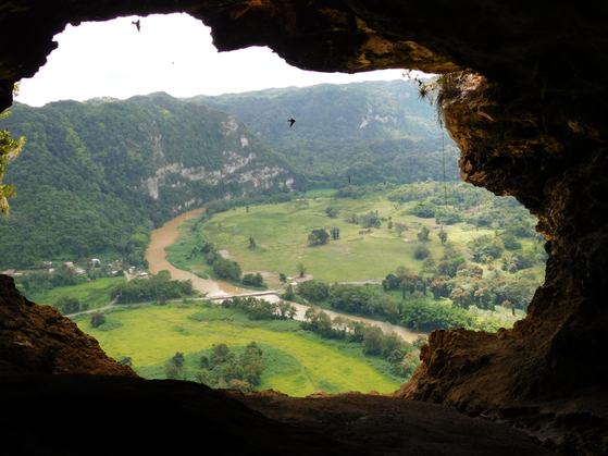
This is the picture I based my painting off of.
1.Describe the craftsmanship of your painting. (Is it neat and well executed?)
I believe that this painting is well executed because it looks real and similar to the original picture.
2.Describe your choice of colors/color harmonies and how you used them throughout the artwork.
I used the same colors that were in the picture but I changed the color of the river too make it pop and I also used a lot of greens to make the painting look real.
3.How did you create contrast in your painting?
I made the river blue so that it pops and contrasts with the grass. I also added reds, oranges and yellows into the trees to add more color and make the trees stand out.
4.How did you apply textures, highlights and shadows to enhance your artwork?
I added texture on the cave to make it look like real rock. I also added texture on the bush/mountains.
5.How were you able to create depth in your painting?
I made the colors duller as I went deeper into the painting.
6.What painting techniques did you use that made your painting successful?
I layered colors and blended colors together.
7.Describe any difficulties you had creating your drawing and what you could do to improve your drawing?
I had difficulties with the houses because I wanted them to look real but they came out looking a little fake.
8.Explain the successes you had with this painting.
I had success with the cave and trees. I also like the bush/mountains.
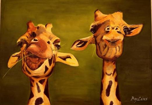
Animal
- For this critique I first want you to discuss your painting. Use your own words to describe, analyze, interpret and judge your artwork. Add art vocabulary to make your critique better. There are no questions to guide you so you need to be as in depth as possible. Discuss how accomplished value, texture, layering, blending, contrast and realism. What is the most important aesthetic quality of your painting? If you are unsure what aesthetic means then look up the meaning and write it with your critique. Explain your creative process. Discuss how you used techniques learned in class to create a successful painting. Reflect your growth through the project. Discuss craftsmanship and quality of your painting.
Bob Ross Painting
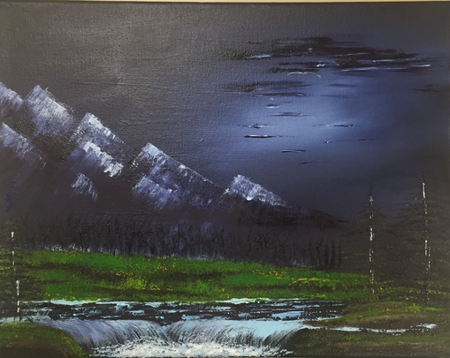
This Bob Ross painting in my opinion was really fun to do. It was hard but fun to follow along with him and recreate on of his paintings. It was difficult because he moved at a fast past but overall I think I did a good job recreating his painting. I used a pallet knife for the mountains which i’ve never done before so it was fun experimenting with that. The canvas also started out black which made it difficult to see the shade of purple on top so it turned out to be more blue than I wanted but I like darkness of the painting. The waterfall was also a nice touch and really gave the painting life, I didn’t know creating a waterfall would be so easy. The trees are a little hard to see because of the dark background but I think they also add some life to the painting. Overall I enjoyed making this and would recreate another one of his paintings. :)
